Hello world! I am currently now on SPRING BREAK! Thank the lord! This has been amazing as it has given me the perfect opportunity to relax and take more time to finish up some of the last things for my project. Today, I write to you about how Taylor and I created the film poster for our two trailer film.
We ended up utilizing a website called Canva.com which features a plethora of ways for us to create different computer generated designs. Taylor and I are both in Student Government and have to create engaging social media blast posts for our school all the time, so we are both pretty well versed in the website.
I already did research on film posters from last year's AS Level project I created Red Room when I created a film poster for that film opening. I looked at everything and below is the main list of conventions that I followed with Taylor in order to create the film poster:
- Must include film title.
- Main Actors names are always highlighted.
- Usually involve some sort of tag line that goes with the vibe or plot of the film. Can even be a quote from the film.
- Bottom is used as a listing area for listing directors, film production companies, actors, listing website (did not include a website URL last year because I did not have to create one for that project), film release date/area, and film the film's rating.
Here is a link to the post where I did research on a lot more movie posters from last years project:
Because we did a drama film however, we wanted to look at the conventions used in many drama film posters, since last year I did a horror film I was going for a totally different look.
Movie posters in the Drama genre Taylor and I really loved ascetically included these we researched:
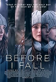
(Before I Fall 2017)
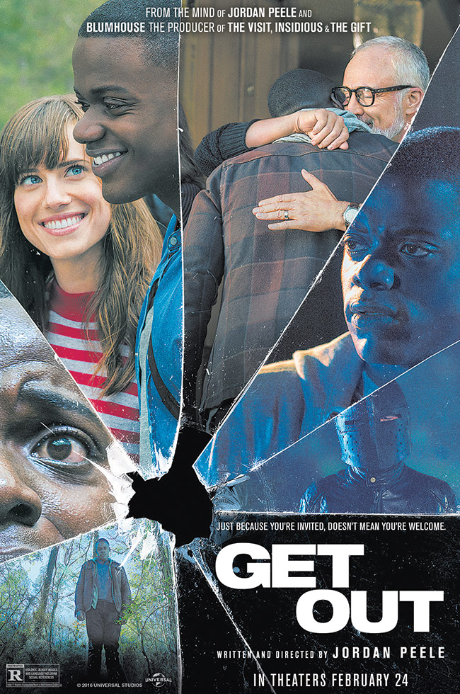
(Get Out 2017)
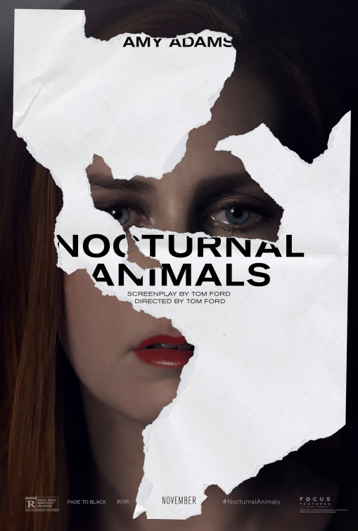
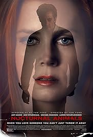
(Nocturnal Animals 2016)
With Drama films we found, like with the first Nocturnal Animals film poster, they don't usually have to fit in with conventions, as long as the image or poster looks visually enticing and dare I say dramatic (teehee).
Taylor and I loved the second Nocturnal Animals film poster as well as the Before I Fall one, and used those film posters as creative inspiriting for our own.
We wanted to imitate the layered photo effect from the second Nocturnal Animals poster with the cutting edge and choppy look from the Before I Fall poster.
Taylor is really great with Canva, I call her the Canva Queen, so she actually taught me a ton with the building of this poster. She taught me how to layer photos on top of each other through transparency editing. Then through many templates and research I found a way to create a PG-13 symbol to add onto our film poster which made it look very official. We then chose a color scheme for the film poster which we will also use on the website (Dark Green, light creamy yellows, and white).
Through many drafts and lots of editing and redoes, we finally came up with the final product. Ready to see it! Look below and feast in the magical awesomeness that is our film poster for Feel Again!!!!!!!!!

Whelp! We hope you love it! Many hours went into this! We really love how the forest photos we got in the background look like they are growing into her and how the bottom is layered with both the beautiful dock shot we got with the spilled bottle of red prop pills we created.
Next Stop, the film's website!
See ya then!
-Ash
No comments:
Post a Comment