Sunday, April 16, 2017
Creative Critical Reflection A Level
Below is the link to my Creative Critical Reflection for my AICE Media A Level project Feel Again:
Final Project Film Trailers, Website, and Movie Poster (Feel Again)
Below are the links to the different components of my AICE Media Studies A Level project Feel Again:
Trailer #1 (Movie Theater Trailer) - https://www.youtube.com/watch?v=G5fT3ApGAVo
Trailer #2 (Social Media Trailer) - https://www.youtube.com/watch?v=y8qEjPIT6K0
Film Website - http://feelagainmovie.weebly.com
Film Poster -

Trailer #1 (Movie Theater Trailer) - https://www.youtube.com/watch?v=G5fT3ApGAVo
Trailer #2 (Social Media Trailer) - https://www.youtube.com/watch?v=y8qEjPIT6K0
Film Website - http://feelagainmovie.weebly.com
Film Poster -

Friday, April 14, 2017
Website

Taylor and I did a lot of research + I utilized what I learned from my Post Modernism marketing and advertising lessons and projects in order to create a comprehensive and beautiful project.
Websites we utilized for research are the ones as follows:
- http://www.focusfeatures.com/nocturnalanimals
- beforeifallfilm.com/
- http://www.edgeof17.movie
- http://melaniemartinezmusic.com
- https://www.universalpictures.com/movies/get-out
- http://lionmovie.com
One of the trends that Taylor and I noticed was how the home pages on all of these sites were very
scrollable (which means there is a large home page section with a few other links/tabs above on the top
of the home screen). I understand this trend, as it mimics the scrolling nature of the worlds top social media
sites like Facebook, Instagram, Twitter, etc., being an entirely scrollable format. It makes the consumer feel
like it resembles the sites the normally use subconsciously, thus why Taylor and I are noticing this major
trend.
So for our home page, we included a main image flag at the top of the page, listing the film title, rating, and
release date. We wanted the site to be user interactive and relate to post modernism aspects of hyperrealism
by making the consumer become all encompassed with the website. I created a Spotify playlist that would
be updated on the site weekly which is a great way to market to Gen Z and Millennials as it is the fastest
growing music streaming site next to now emerging Apple Music. All I did was add songs we believed would fit
our film, copy the embedded link, and put it on our site.
Many home pages utilize a quote like "See more below" or "Discover the movie below" which entices the
consumer and lets them know that the site is scrollable.
We included both of our trailers on the home page as they scrolled down, put social media links and bars
on the top and bottom of the website, and finished that page off with a little "Mini Photo Gallery" with a block
quote which would entice our consumer to want more visual stimulation in the larger photo gallery tab at the
top of the page.
Tab two was the photo gallery tab, so for this one I created an Instagram like feel by creating three photos
per row of photos. Taylor and I didn't love the discombobulated and all over the place photo placement of some
of the movie website, while we loved the format of Melanie Martinez's music website (We found it interesting
how a music artist's website is very similar to a movie's website). Thus, we believe the cleaner more Instagram-
like ascetic for the website would be more visually pleasing. And because it is the "Photo Gallery" we both
included our film poster on the home page and the photo gallery tab.
Tab Three "Something Special" is inspired by our post modernism marketing techniques learned earlier this
year. Sometimes people in our generating (really all the time) hate to be marketed to directly and like a
little bit of mystery and self discovery. This discovery want makes the user feel more in control of their
content, thus makes them feel like they are not being directly marketed to. The something special tab
features a movie bloopers video we compiled which puts a human behind the actor, which not only helps
branding but makes the user feel connected better to the actors and production of the movie, like they're
are real people, teens, behind the making of it all, creating brand trust through that post modern concept.
Tab four "Seeking Help" we thought would also be imperative to add to our site. Our film deals a lot with
teenage drug abuse, and many movie websites include things like donation areas to causes that have to do
with the film and recourses that go along with the films narrative, so we created a blog posting (feels more
personal to the consumer) from "Team Feel Again" that supported seeking help from teenage drug abuse
along with the resources, websites, and phone numbers to find help. Not only does this resemble conventions
of film websites, it makes everything feel more heavy and real to the consumer, getting them trapped in this
little bubble website for our film (Once again hyper realism and post modernistic marketing strategy at use
here).
Tab five "Contact" included an area for people to directly contact the creators and actors of the film through
a fill out form I created. The names of the actors and producers were listed on the left with a cute little inside
fact joke or description of the person working in the film, making the people viewing the names like they are
real people and maybe make them want to research the name to find out more about them now that they
know some strange or random thing about them. This enticement of the consumer and making the consumer
feel more attached to the film and the people who make the film creates the films own universe where
people want to research more about the film and the names behind it. Making it all feel human and not
directly marketed to the consumer as stated by Gen Z and Millennial post modern marketing tactics.
I utilized Weebly to create my website as it is free and comes with so many great templates to create a beautiful
and cohesive website.
The color scheme we used was inspired by the film's poster which was dark green, yellow, and white.
Here is our link to the site!!!!!
http://feelagainmovie.weebly.com
Hope you enjoy!
-Ash
Monday, April 10, 2017
Movie Poster
Hello world! I am currently now on SPRING BREAK! Thank the lord! This has been amazing as it has given me the perfect opportunity to relax and take more time to finish up some of the last things for my project. Today, I write to you about how Taylor and I created the film poster for our two trailer film.
We ended up utilizing a website called Canva.com which features a plethora of ways for us to create different computer generated designs. Taylor and I are both in Student Government and have to create engaging social media blast posts for our school all the time, so we are both pretty well versed in the website.
I already did research on film posters from last year's AS Level project I created Red Room when I created a film poster for that film opening. I looked at everything and below is the main list of conventions that I followed with Taylor in order to create the film poster:
- Must include film title.
- Main Actors names are always highlighted.
- Usually involve some sort of tag line that goes with the vibe or plot of the film. Can even be a quote from the film.
- Bottom is used as a listing area for listing directors, film production companies, actors, listing website (did not include a website URL last year because I did not have to create one for that project), film release date/area, and film the film's rating.
Here is a link to the post where I did research on a lot more movie posters from last years project:
Because we did a drama film however, we wanted to look at the conventions used in many drama film posters, since last year I did a horror film I was going for a totally different look.
Movie posters in the Drama genre Taylor and I really loved ascetically included these we researched:
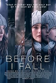
(Before I Fall 2017)
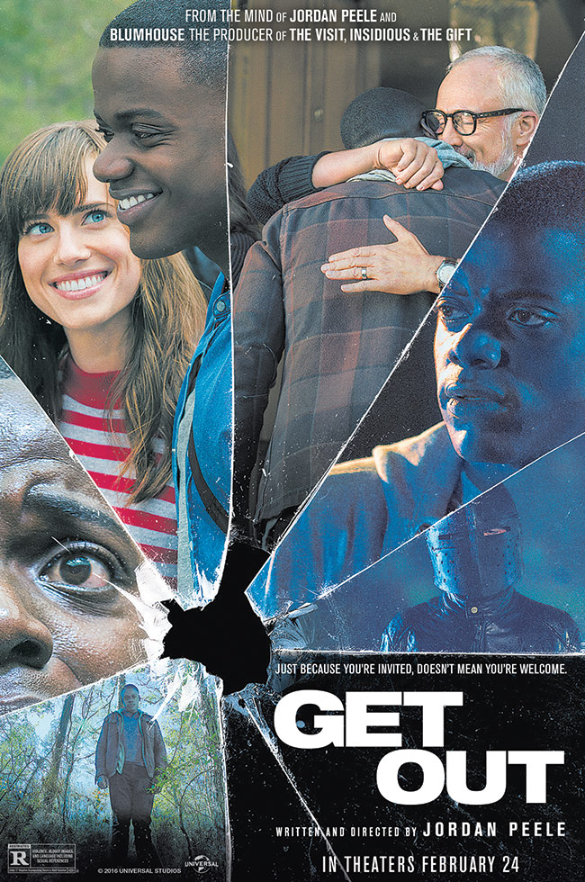
(Get Out 2017)
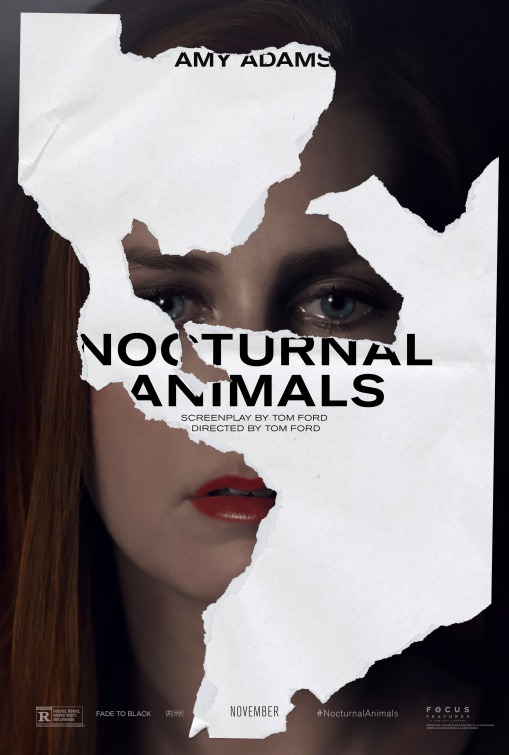
(Nocturnal Animals 2016)
With Drama films we found, like with the first Nocturnal Animals film poster, they don't usually have to fit in with conventions, as long as the image or poster looks visually enticing and dare I say dramatic (teehee).
Taylor and I loved the second Nocturnal Animals film poster as well as the Before I Fall one, and used those film posters as creative inspiriting for our own.
We wanted to imitate the layered photo effect from the second Nocturnal Animals poster with the cutting edge and choppy look from the Before I Fall poster.
Taylor is really great with Canva, I call her the Canva Queen, so she actually taught me a ton with the building of this poster. She taught me how to layer photos on top of each other through transparency editing. Then through many templates and research I found a way to create a PG-13 symbol to add onto our film poster which made it look very official. We then chose a color scheme for the film poster which we will also use on the website (Dark Green, light creamy yellows, and white).
Through many drafts and lots of editing and redoes, we finally came up with the final product. Ready to see it! Look below and feast in the magical awesomeness that is our film poster for Feel Again!!!!!!!!!

Whelp! We hope you love it! Many hours went into this! We really love how the forest photos we got in the background look like they are growing into her and how the bottom is layered with both the beautiful dock shot we got with the spilled bottle of red prop pills we created.
Next Stop, the film's website!
See ya then!
-Ash
Friday, April 7, 2017
Trailer #2 Is Edited & Complete!

I stand in front of you today a humble man... BECAUSE TAY AND I JUST FINISHED TRAILER #2!!!! AHHHHHHHHHHHHHHHHASDFGHJKL":!!!!!!!!!
This trailer was our social media based trailer, which means that it needed to be a bit different than our other first trailer. Here as some basic differences in how our second trailer is different than our first in both target audience and portrayal on medium.
- Our movie trailer could be a little over two minutes no problem (average movie theater trailer is 1:30-2 Minutes), while our social media should really be 60 seconds or less due to the faster consumption of social media and the limitations that some platforms allow like Instagram strictly limiting video lengths.
- Our social media trailer needed to attract your attending in a snap, so by providing a intense and beautiful shot to start of (we were inspired by the Nocturnal Animals trailer beginning for our opening scene with the extreme close up of the eyes). Social media is always about what is the next thing that will stimulate the consumer and make them want to actually stay and consume something, and we accomplished this with our trailer beginning.
- We included a ton of face paced editing in intense bursts to create a more hectic feel we believe that would broadcast to a more thriller drama or intense/psychological drama about drug abuse.
- Unlike our first trailer, we really don't give almost any of the plot away (Once again inspired by Nocturnal Animals and also Ghost in a Shell). With social media, you always want to leave the consumer wanting to consume more, thus it is important with social media trailer advertisements that we don't give everything away, that way they become invested and then watch the film's full movie trailer. That is how you hook a consumer and gain more views.
- We included a lot more intense and almost angry voice overs compared to the more soft and lost feeling portrayed in the first trailer.
It is obvious to see that both trailers are based off and from the same movie, but they correspond to totally different audiences on different mediums, thus broadening our viewership audience as a whole (SMART!)
Like the first trailer, I created a Youtube Thumbnail for the video to better advertise the video on the internet (especially important when people will be seeing the thumbnail first everywhere on social media, so we took some extra time for this one. FORESHADOWING- It is similar to the film poster we are currently creating... but more on that later! I can't give all my secrets away yet!)
Check Out Trailer #2 Below!!!
Next to tackle is the website which is currently in production and my film poster which my teammate Tay is having a major role in because she is a photoshop Goddess!
-Asher
Wednesday, April 5, 2017
Trailer #1 Edited and Done!

Whelp! The title really says it all! Taylor and I finished editing and published our 1st of two trailers. The first trailer Tay and I finished was the Movie Theater Trailer and it looks glorious.
Being that this trailer is being featured in the movie theater, our audience is going to be more genre driven as stated in a previous post, so we included more intense (but still not to deep) electronic synth dramatic music and ended it with a royalty free emotional piano song we found from a Youtube artist.
One of the hardest parts of the entire project was trying to find good music to put in our film. We tried many sites, but in the end my friend gave me a great recommendation that without our film would have probably been not as good. The Youtube Audio Library literally saved us from having to use bad music, because we actually found quality tracks and many of them to decide between.
***Something Random***
(Personally I utilize iMovie to edit all my films as it is really easy to import all the media from from phone onto my computer and start editing right away through the airdrop into iMovie process, plus I've used it now for two years and it is what I am most comfortable with)
For this trailer being the movie trailer, we stuck with the normal film conventions of having more dramatic and emotional scenes to appeal to the viewer. The editing isn't necessarily fast paced except for some of the beginning sequence, but it defiantly isn't slow, so it is in that nice little middle area we want it for the most part.
We did a lot of sound editing as well in order to make the volume flow better at points where when we filmed the voices or background noise seemed too much or the music was competing with the commentary or voiceover.
Overall, this trailer really represents what we wanted it to represent for our first trailer being a drama being broadcasted in a movie theater, and Tay and I would love for you to check it out below!
I also utilized Canva to create a Youtube Thumbnail that better represents the current genre conventions of how movie trailers are featured and viewed on the video streaming site. This would help the trailer garner more attention visually from simply the video's first impression image.
(https://www.youtube.com/watch?v=G5fT3ApGAVo)
Now we are already onto working on Trailer #2, the website, and the film poster... who knows what is next?!?! Well, Tay and I know... you don't.
-Asher
Tuesday, April 4, 2017
Filming Day 3

As much as I do love filming, I am very thankful that I am finally done shooting and I can finally blog about my third and final day of filming (Total Filming Hours for this Project 17-20 hours).
The final film shoot took place at my school (Cypress Bay High School). The school has a massive campus, so there were tons of different areas for us to film, however, being a trailer we were shooting for we only chose a select few locations we believed would be beneficial for our project.
Locations within the school:
- Niche in a hallway to use for conversation
- Long Hallway to get long take walking shot
- Classroom scene (Including taking pills and student interaction).
I honestly thought this was going to be the most simple filming day out of all of them, but filming at school came with a plethora of challenges I seemed to have forgot about before I filmed.
One - The sound Issues! People at my high school can be absurdly obnoxious and loud, so when we started filming in my teacher's Study Hall Class we forgot about how annoying it would be to try and edit out all the background noise. So to try and be smart about the situation, Tay and I asked the class if they wanted to be a part of our film, and many did, which meant that they cooperated with us. Did I actually need or take shots of all of the students. No. But hey it was a great way to shut everyone up and get out shots done.
The sequence of shots that took place in the classroom involved a lot of action matched of a paranoid Nora finishing her work very quickly as she sneaks a pill into her mouth. For this scene to make it look even more sketchy we placed pills in an old mints compact and got some interesting close ups and extreme close ups of this. And to make it look like she was taking a pill (we really weren't going to have our actress take a pill in school) I shot her at an angle where you saw more of her profile of her face at an angle, but it came out looking very clean and realistic and looked like she literally took the pill in class. This is one of my favorite strings of shots I have collected in my high school career as they all flow so easily into each other with some simple editing and it gives off such a sketchy paranoid vibe.
Two - Class Changes! We'd be filming an intense scene and everything was going amazingly until the period would end and the bells would ring and a mob of people would flood the halls. Thus, our shot and scene would be ruined or halted many times as bells and angsty students traveled around class to class photo bombing my shots (God I Hate People My Age).
Three - Security! Even though we had my actress approved to come in, security would be constantly coming up to us, so that got a bit annoying during a beautiful shot when you'd get scared with someone screaming behind you, "Where the hell are you students supposed to be!" even though it was both of our free periods (eye roll).
Here are some snapshots from the school shoot:


We also recorded many different voice overs from Megan to overlay many of our shots and scenes during out more intense social media based trailer.
Now it's off to editing!!!
-Asher
Subscribe to:
Posts (Atom)